Album Cover
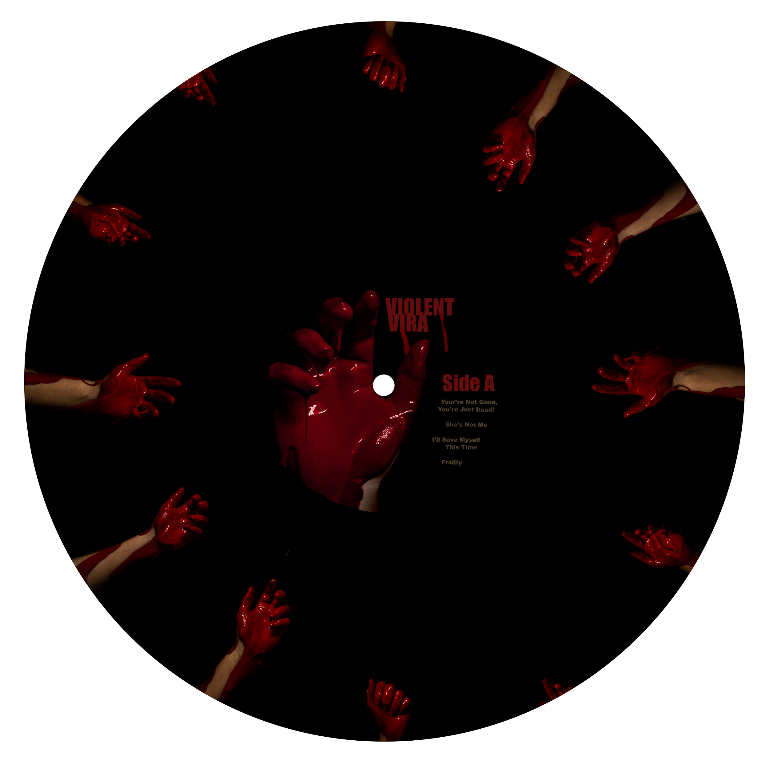
This album cover design effectively utilizes key design principles such as color, balance, hierarchy, typography, and composition to create a cohesive visual theme that aligns closely with the artist’s style. The original imagery was produced through a combination of practical effects and digital editing, allowing me to bring a specific visual concept to life. Using Photoshop, I refined the composition by enhancing details, such as adding or repositioning drips, to amplify the overall visual impact.
Color played a pivotal role in this piece. The blood-red title stands out boldly against the black background, while the incorporation of greenish-yellow hues from the leaves further intensifies the contrast. This not only improves text legibility but also draws the viewer’s eye directly to the title, giving it prominence.
The composition is intentionally balanced to create a sense of fullness without feeling cluttered. The dark background functions as a visual void, allowing the layered photography to emerge with clarity and focus, giving the design both depth and cohesion.
This project came together relatively quickly, with minimal major revisions. Once the concept was developed and the photographs were captured and edited, the design process moved smoothly. Both the hand and the flower featured in the composition are original photographs taken by me. Using red paint and a solid background, I completed most of the initial adjustments in Adobe Lightroom. Through simple masking techniques, I was able to isolate the subjects, apply a clean black background, and enhance specific elements transforming the original images into a dramatically different and more impactful visual.


